
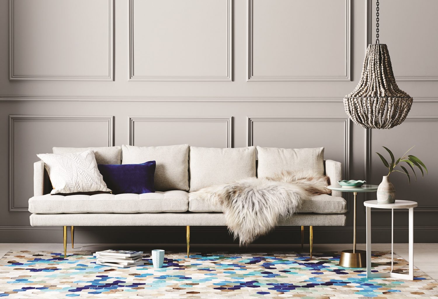

Angula Rug from Art Hide with a palette of current tones www.arthide.co
We all know colours go in and out of fashion – for everything from interior décor to clothing and graphic design, but who decides what’s hot and what’s not? You’d be excused for thinking it’s the fashion elite, or interior design gurus of the world – the likes of Karl Lagerfeld and Kelly Hoppen – right? Well think again…the colour tendsetter of the western world is in fact PANTONE®.
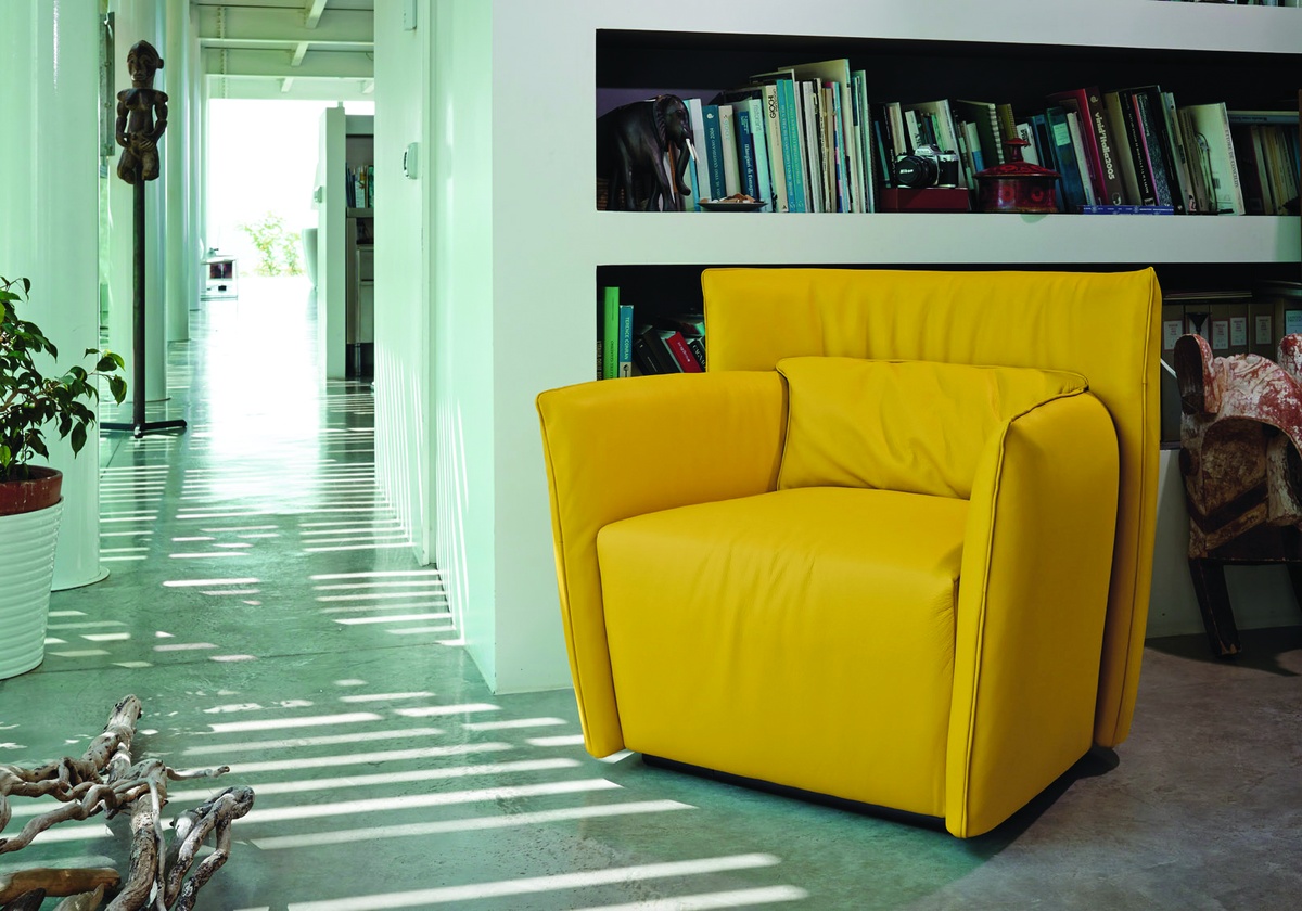
Tulip Swivel Occasional Chair from Sovereign Interiors www.sovereigninteriors.com.au
If you’ve ever designed a logo, approved a brochure or had a business card printed, you’re probably familiar with the name PANTONE – a company which has built its reputation by developing colour matching formulas. Well it is in fact PANTONE ”Colour Forecasters” who research colour popularity and trends, based on that they predict what colours will be popular up to two years ahead. Designers and manufacturers of all kinds – fashion, interior, furniture and more tend to base their collections and new ranges on the PANTONE forecasts, which is why you see the same colours in all the stores.
So what are the colours for 2017? Many of the hues for next year echo the colors of nature, both muted and earthy and vivid and bright. From Hazelnut, a pale earthy tone, to the vibrant Primrose Yellow . There are several blue tones from the dusty Niagara, to the appropriately named Island Paradise which looks like the water of Bora Bora.


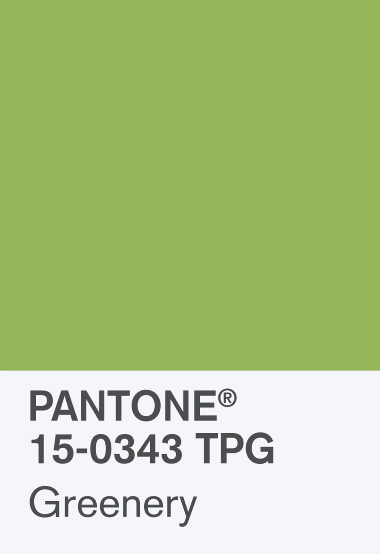
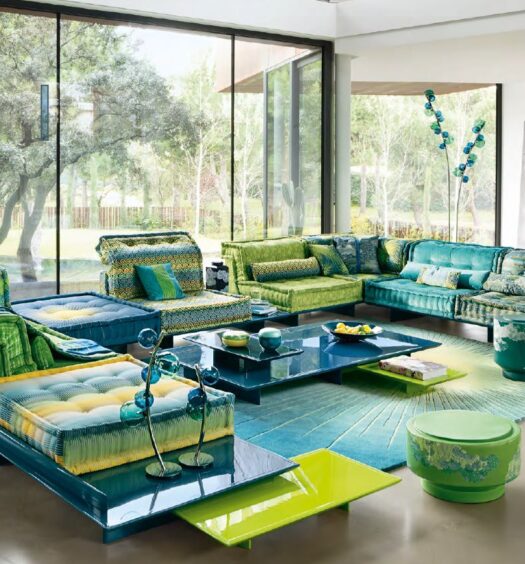
COLOUR OF THE YEAR – GREENERY
The top pick for 2017 – named as Pantone colour of the year is Greenery
Executive Director of the Pantone Colour Institute, Leatrice Eiseman, was very philosophical about the choice saying ‘Greenery’ symbolises “the reassurance we yearn for amid a tumultuous social and political environment” and “the reconnection we seek with nature, one another and a larger purpose.”
So here’s to a green year!
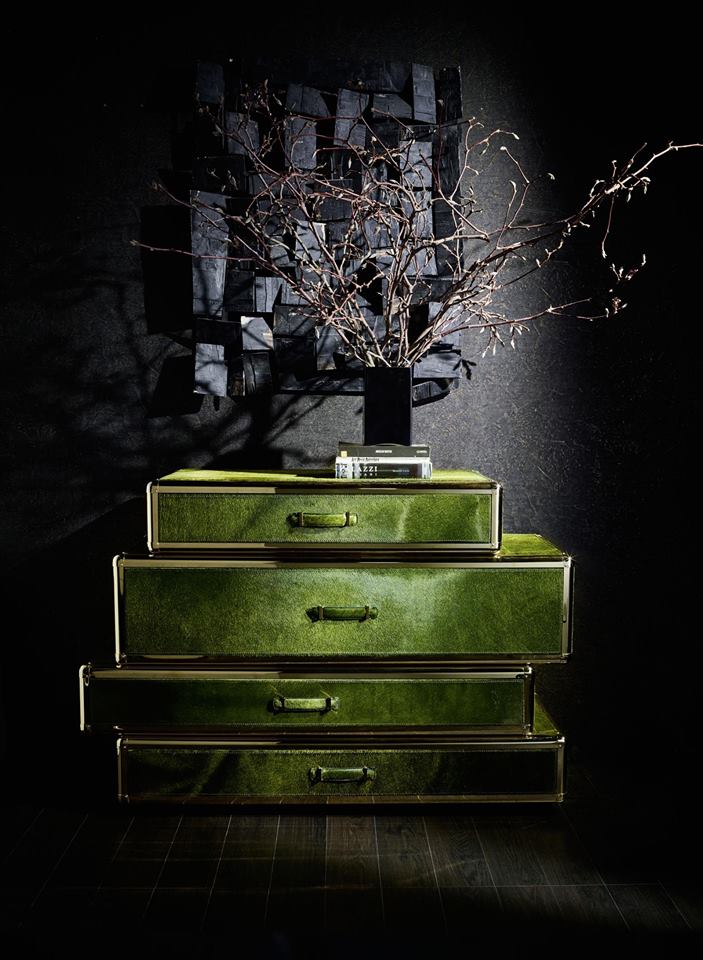
Roberto Cavalli drawers available from Roberto Cavalli Home, Sydney
Tags
Colour Choices 2017 Colour of the Year Colour of the year 2017 as advised by Pantone Colour Trends 2017 Pantone 2017 Colours Pantone Colour of Year 2017 Pantone Colours 2017 Top colours for 2017 Top Interior Colours 2017 Top Interior design Colours trendy colours What Colours are inYou Might Also Like

Recent Comments