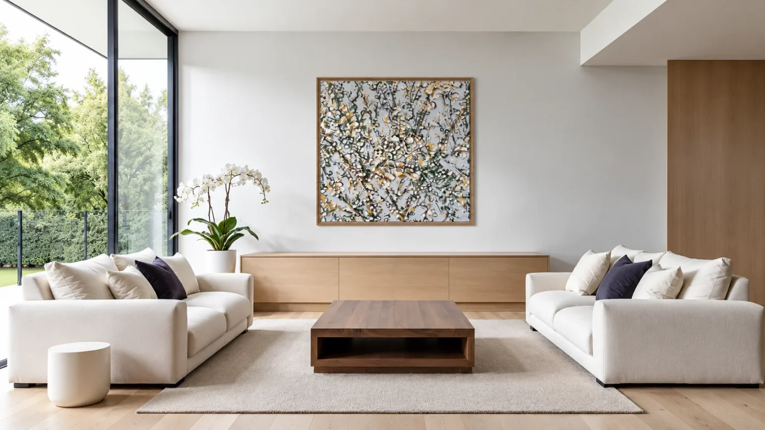

There is just something about the colour yellow that screams happy – sunshiney, summer vibes! For anyone who loves its vibrant warmth but is nervous about committing to a yellow sofa, or an entire painted wall, art offers a much more refined way to bring it into an interior.
And the beauty of yellow is that you really don’t need much. Even a small flash can lift stone, timber, grey, white and other soft neutrals, adding warmth and personality without taking over the room.
It is something Australian artist Felicia Aroney does particularly well, using yellow in everything from bold mustard fields to small bursts woven through white, blue, charcoal and cream.
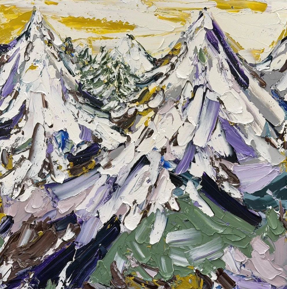
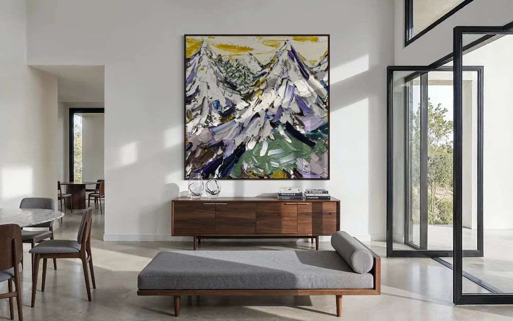 “Snowcapped” 183x183cm Acrylic on canvas dark oak box framed
A Little Can Change A Lot
In Earthlight, yellow appears almost as an accent rather than the main event. The painting is built around soft blue-grey, white and charcoal, with small bursts of yellow moving through the composition. From a distance, the work still feels restrained, but those touches of colour stop it from disappearing into a neutral interior.
This is where yellow works particularly well in art. It doesn’t have to dictate the palette of the room. A painting can introduce just enough of it to break up pale upholstery, stone or timber and bring another layer into the space.
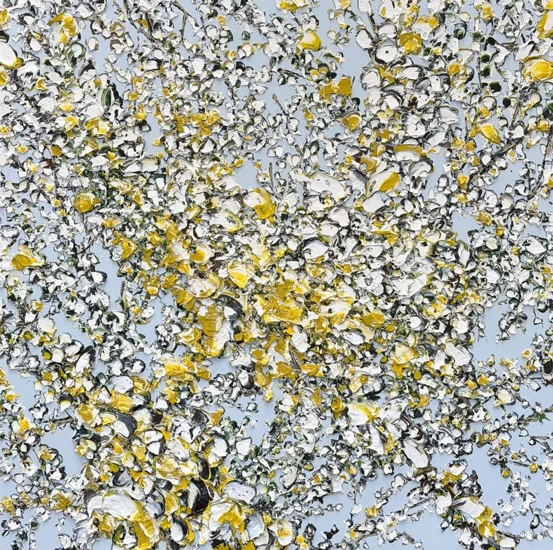
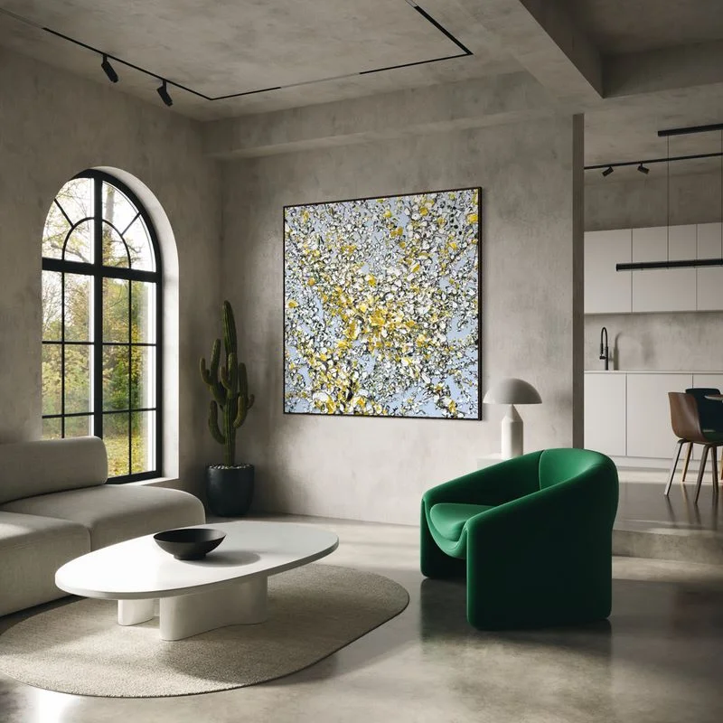 “Earthlight” 153x153cm Oil and acrylic on canvas dark oak box framed
Reaching Light works in much the same way. Here, warm yellow and ochre tones appear amongst sculptural white forms and darker detailing. In an interior with natural timber, earthy upholstery or darker furniture, those warmer notes help connect the artwork to its surroundings without everything needing to match.
And that is perhaps one of the biggest mistakes people make when choosing art — assuming it has to repeat the exact colours already in the room. Often, the most successful piece is the one that introduces something new.
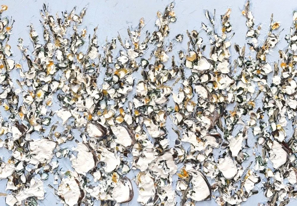
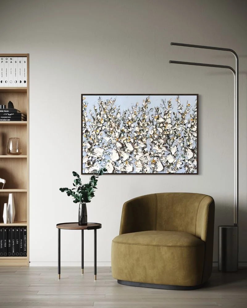 “Reaching light” 73x103cm Oil and acrylic on canvas oak box framed
When Yellow Becomes The Room’s Focal Point
At the other end of the scale is Mustard #2.
This large-scale work is unapologetically yellow, but its rich mustard tone gives it a very different character to something bright or citrusy. The warmth of the colour makes it particularly suited to interiors built around walnut, oak, stone, brown, cream and other natural finishes.
Up close, the surface becomes just as important as the colour itself. Aroney’s heavily textured application creates shadow and movement across the canvas, so what first appears to be a single field of mustard changes depending on the light and where you are standing.
For someone wanting a true statement piece, this is where yellow abstract art can completely alter the mood of an interior. A room that might otherwise be made up almost entirely of neutrals suddenly has a focal point, without needing layers of decorative colour elsewhere.
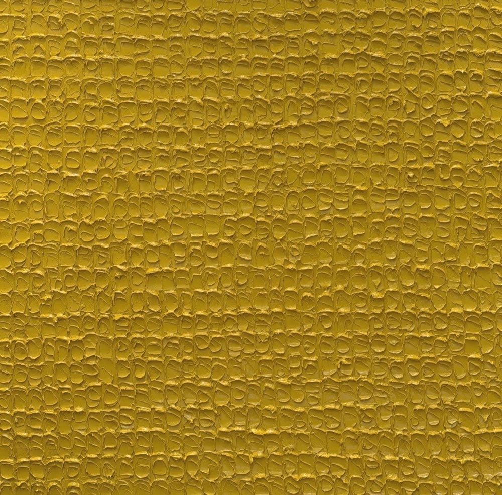
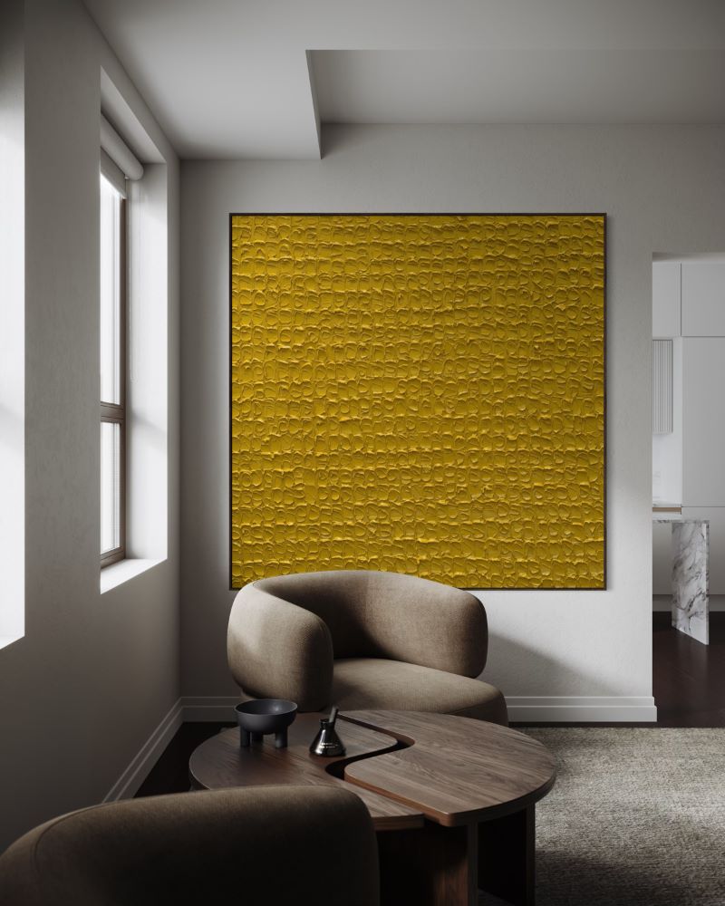 “English mustard #1” 183x183cm Acrylic on canvas dark oak box framed
Yellow Doesn’t Have To Feel Bright
That becomes even more apparent across works such as Sundance, Suntrace and Veil Light.
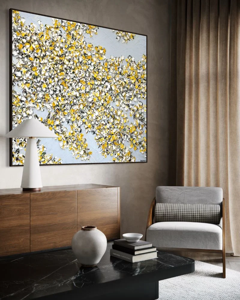
In Sundance, yellow is more expressive, moving through oversized floral forms against pale blue and white. It is undoubtedly bolder, yet the texture and painterly surface prevent it from feeling overly decorative.
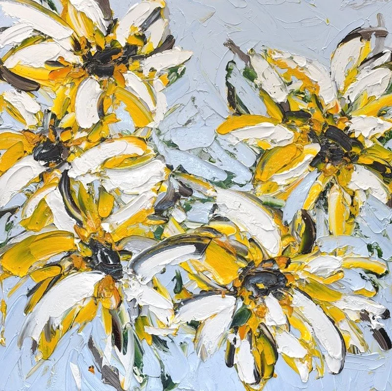
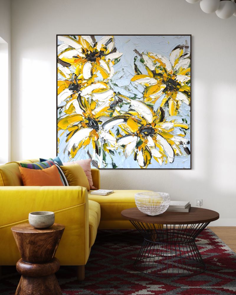 “Sundance” 163x163cm Oil and acrylic on canvas dark oak box framed
Suntrace takes a more restrained approach, allowing yellow to appear amongst white, black and cooler blue tones. It is the type of painting that could work particularly well in a contemporary interior where the overall palette is minimal but the room needs something to lift it.
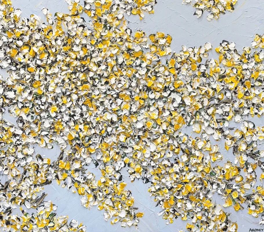
 “Suntrace” 143x163cm Oil and acrylic on canvas dark oak box
Then there are works such as Velvet Noir, where yellow is used against a much darker ground. Here, the colour takes on an almost luminous quality. Rather than simply adding brightness, it creates contrast and depth.
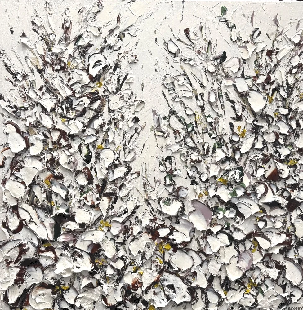
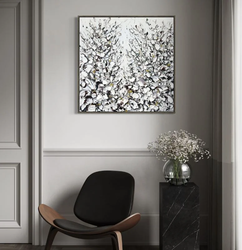 “Veil light” 83x83cm Oil and acrylic on canvas dark oak box framed
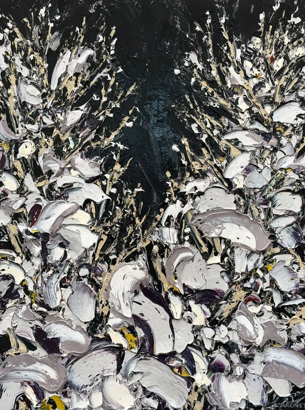
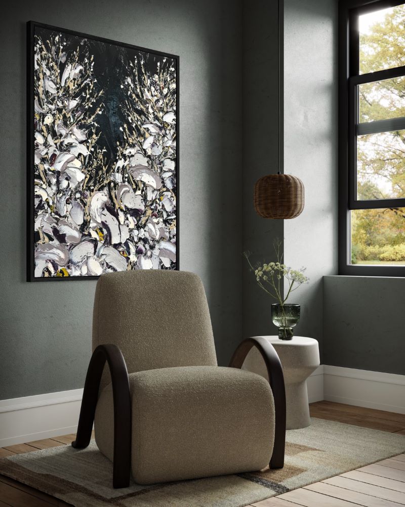 “Velvet Noir” 125x94cm Oil and acrylic on canvas, black box framed
That versatility is what makes yellow surprisingly easy to live with. Ochre, mustard, saffron, butter and stronger golden tones all behave differently, meaning the colour can feel earthy, fresh, dramatic or soft depending on what surrounds it.
Art As The Place To Be Braver
There is also something liberating about using art as the place where you take a little more risk.
Flooring, cabinetry, stone and major pieces of furniture are long-term decisions. They tend to be the elements people approach cautiously, particularly in a luxury home where materials are chosen to last. Art gives you more freedom.
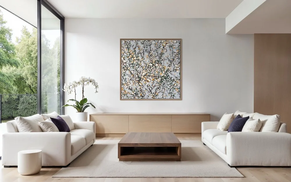
A painting can introduce a colour you might never have contemplated elsewhere. It can sit against a pale wall and completely change the feeling of the room, or pull together colours that previously seemed unrelated. And because Aroney’s paintings are so heavily textured, they bring another dimension altogether — the surface changes as natural and artificial light moves across it.
Perhaps that is what this collection demonstrates best. You don’t need to redesign an interior around yellow for the colour to make an impact. Sometimes all it takes is one extraordinary painting, and just enough yellow to make the rest of the room look different.
Aroney Art Gallery is located at 84 Oxford St Paddington, Sydney www.feliciaaroney.com
Tags
abstract art for interiors contemporary Australian art Felicia Aroney original Art statement art for interiors textured abstract paintings yellow abstract art yellow artwork yellow paintingsYou Might Also Like